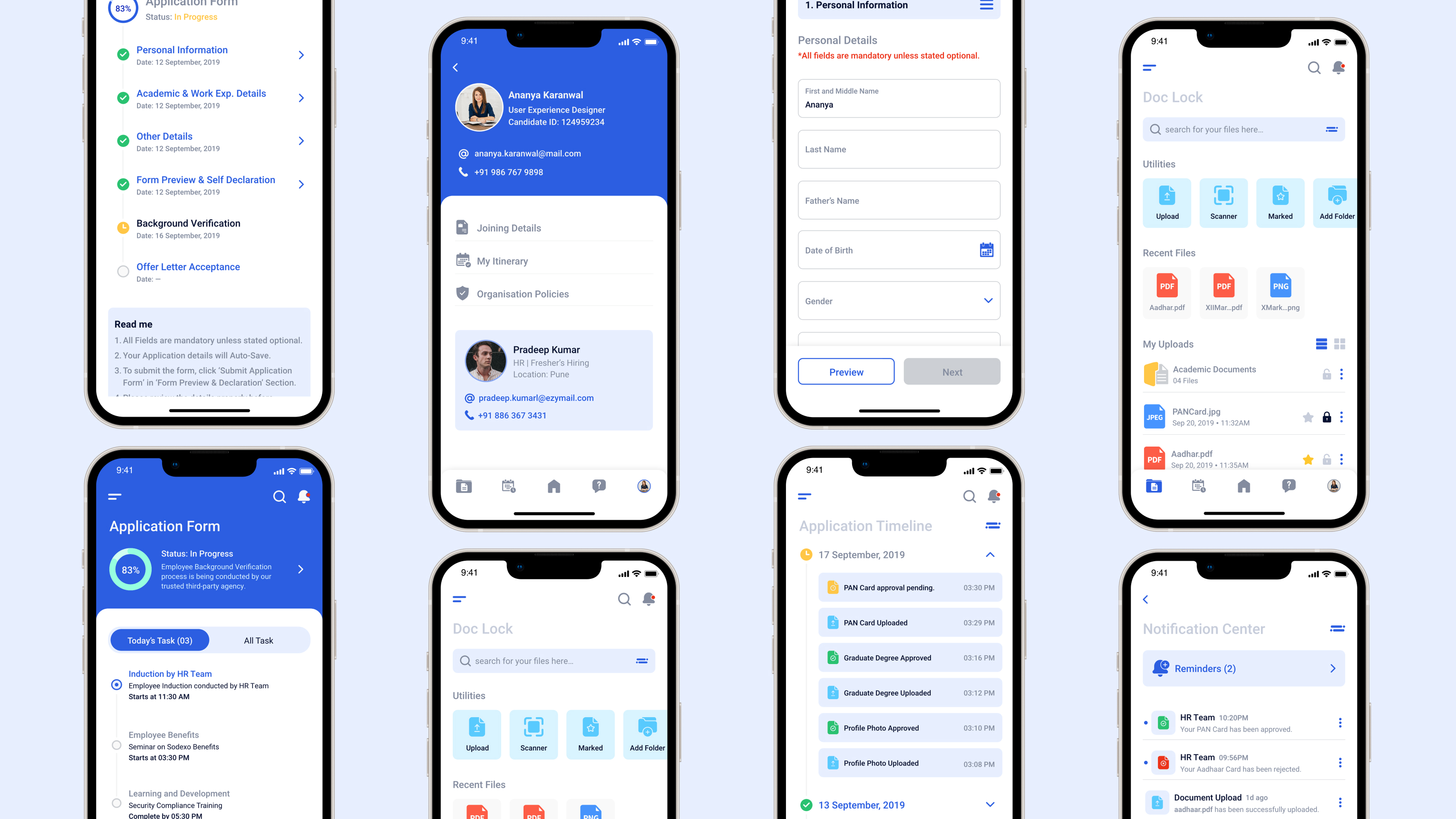
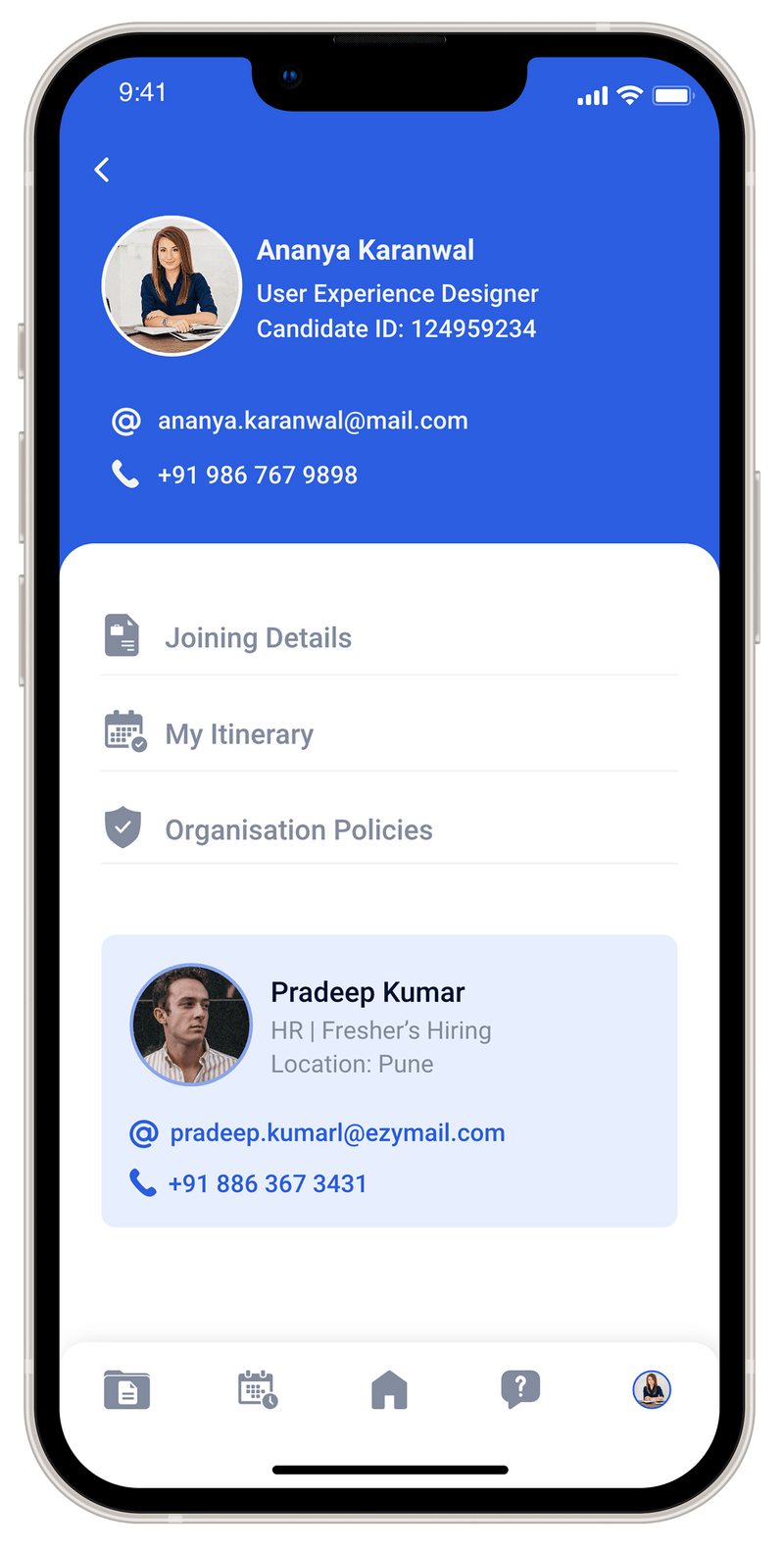
New hires at Tata Consulting Services faced a fragmented, paper-heavy onboarding journey with no visibility, no self-service, and no clear path from offer letter to first day. I designed OnboardIT — an end-to-end platform to fix that.

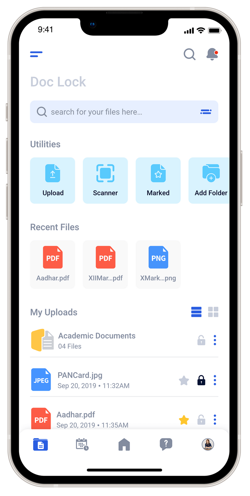
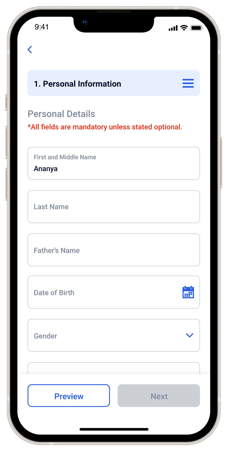
Tata Consultancy Services is one of the world's largest IT services companies — onboarding thousands of new employees every year across multiple geographies. Despite that scale, the onboarding experience was almost entirely manual: offer letters, document submissions, inductions, and location assignments were handled through a patchwork of emails, physical paperwork, and disconnected internal portals.
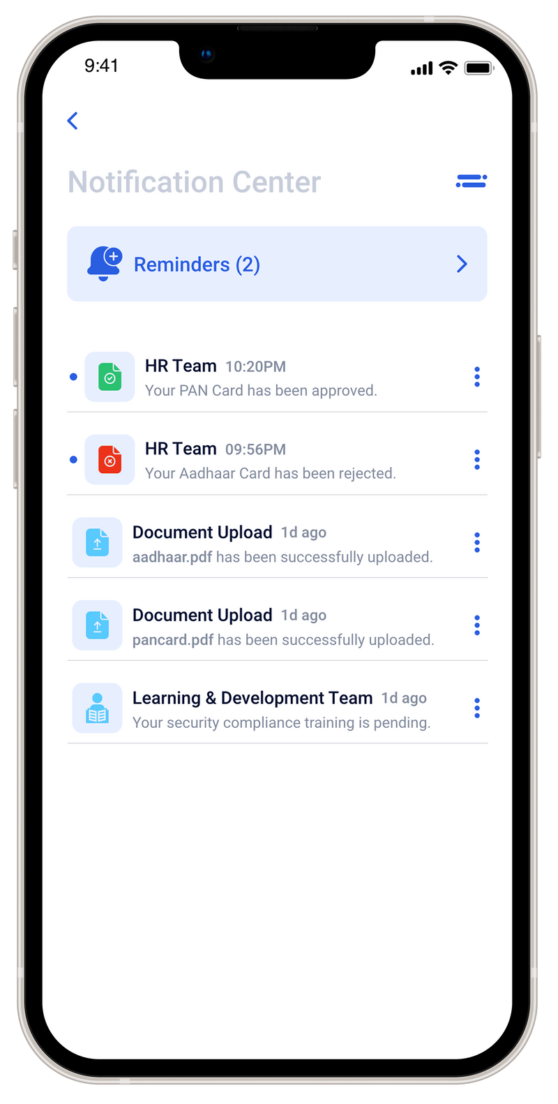
New hires — particularly fresh graduates joining for the first time — had little visibility into where they stood, what was needed from them, or who to contact when things stalled. The result was anxiety, delays, and a poor first impression of the company they'd just committed to.
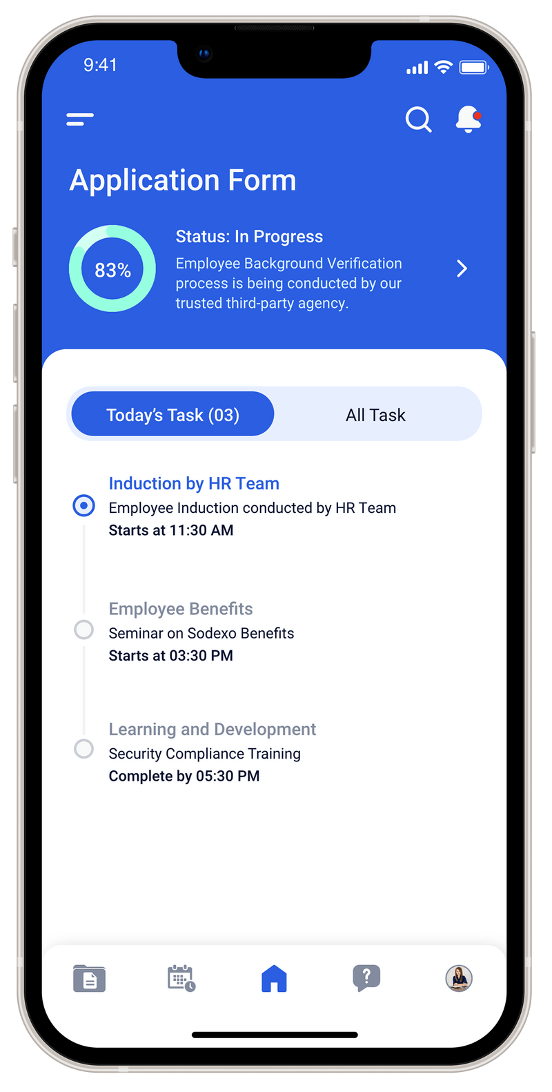
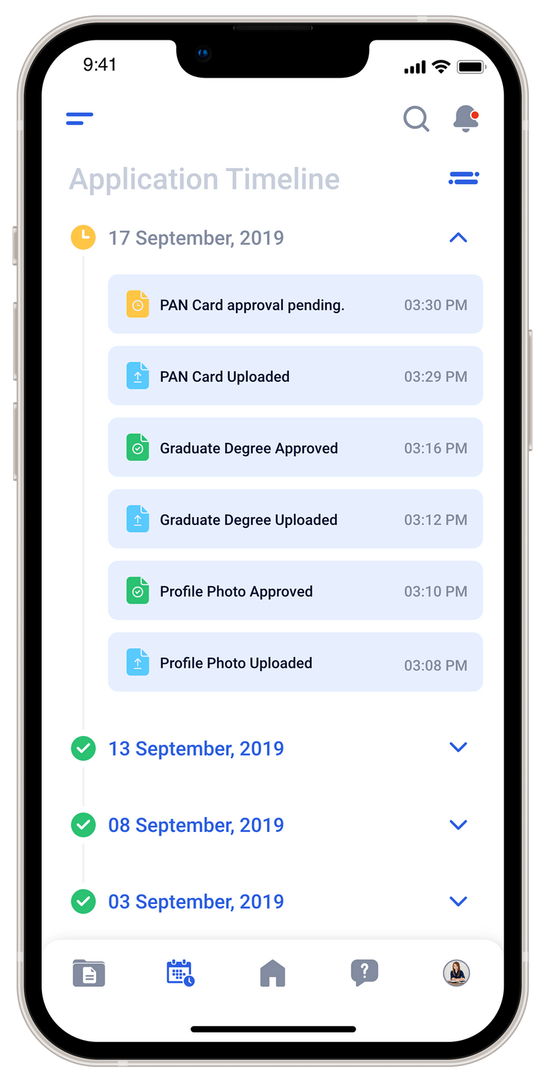
TCS needed a proof-of-concept for a centralized digital onboarding platform that could handle registration, document collection, training assignments, and location joining — reducing manual overhead and improving the new hire experience at scale.
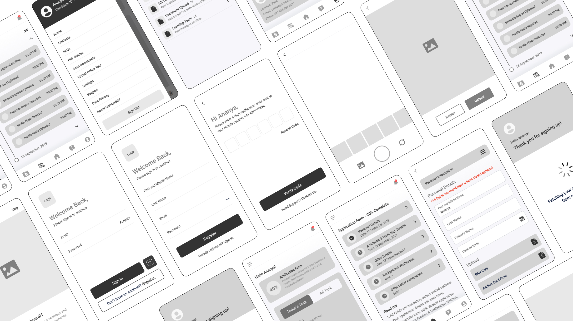
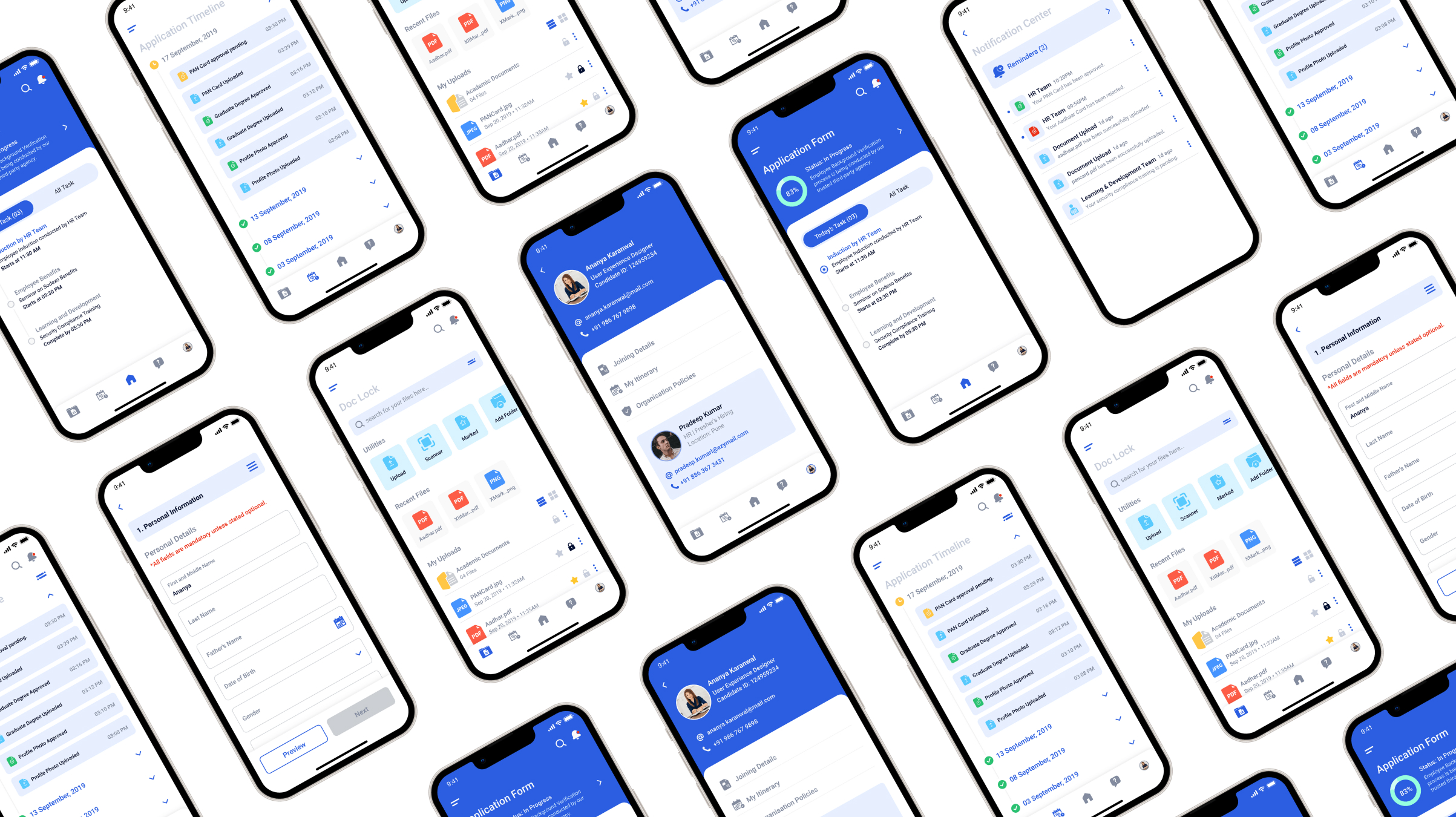
I owned the project end-to-end — from conducting user research and synthesising insights to defining the information architecture, creating wireframes, building a design system, and delivering a high-fidelity interactive prototype in Adobe XD.
Through structured and semi-structured interviews with new joiners and internal HR stakeholders, I mapped the key failure points across the onboarding journey. The issues weren't isolated — they were systemic.
Submitting degrees, certificates, and ID documents required physical copies or fragmented email chains — error-prone, slow, and impossible to track once submitted.
New hires were expected to complete mandatory courses, inductions, and form submissions — but had no single place to see what was outstanding, overdue, or done.
New hires had no way to track where they were in the process. Every update required chasing an HR contact, creating anxiety and flooding internal teams with avoidable queries.
Updates, reminders, and policy information arrived via email, WhatsApp, and verbal instruction — with no single source of truth for the new hire to return to.
Fresher hires in particular lacked easy access to policies, point-of-contact details, and location information — leaving them underprepared for their first day.


With only two weeks to deliver a working prototype, every design decision had to be intentional. I followed a tight four-phase process — anchoring design choices in research rather than assumption at every stage.


Each feature was mapped directly to a pain point uncovered in research — nothing was designed speculatively.
Together, they cover the full arc of the onboarding experience.

A personalised dashboard giving new hires an at-a-glance view of their onboarding status, outstanding tasks, and upcoming milestones — replacing the uncertainty of email-based updates with a clear, structured overview.
A chronological view of every action taken across the onboarding process — by the hire and by HR stakeholders. Designed to eliminate the need to chase updates and give new hires confidence that things are moving.


A centralised hub for organisation policies, point-of-contact details, and location joining information — ensuring new hires always knew where to look, rather than digging through email threads.
A mobile-first document scanner and upload tool — letting users capture and submit degrees, certificates, and ID documents directly from their phone. Replaced physical submissions and fragmented email attachments entirely.


A structured multi-step form for submitting personal and professional details required during onboarding — broken into logical sections to reduce cognitive load and minimise errors at submission.
A unified feed for all onboarding updates and reminders — with the ability to set personal reminders for pending actions. Replaced the fragmented mix of emails and informal messages with a single, reliable channel.


OnboardIT was my first experience designing under genuine sprint pressure — and it reshaped how I think about scoping. The temptation in a project like this is to solve everything. The discipline is knowing which problems, if solved well, make the rest feel smaller. In this case, that meant anchoring on visibility and document submission before anything else.
Working across two distinct user personas also sharpened my thinking about designing for range — building a single experience that felt appropriately tailored to both a nervous first-time joiner and a confident lateral hire, without bifurcating the product.